Packaging, Brand Identity, + Brand Expression
Lunchables Charcuterie
An exploration of package design, brand identity, and brand expression for the popular children’s on-the-go lunch
The Challenge
This product meets a new and emerging market for on-the-go healthy adults. The challenge was to reenvision the traditional Lunchables product brand with the focus of a Millenial, upscale, portable, & healthy market.
Process & Sketches
The original Lunchables packaging incorporates a plastic container with a plastic film which the user has to peel off. From my own experiences opening this product, I observed that this interaction with the packaging made the product itself feel more processed and less crafted. With this in mind, I began to concept a different way to open the product such that it would elevate the user experience and better cater to my target audience.
Approaching the Design
With my goal of elevating the user’s experience in mind, I settled on a hexagonal design which allowed each food item to be housed in its own compartment.
In order to elevate the user experience, I minimized the use of plastic film and instead incorporated small sections which the user opens by unrolling the hexagonal package and lifting the tab to each container.
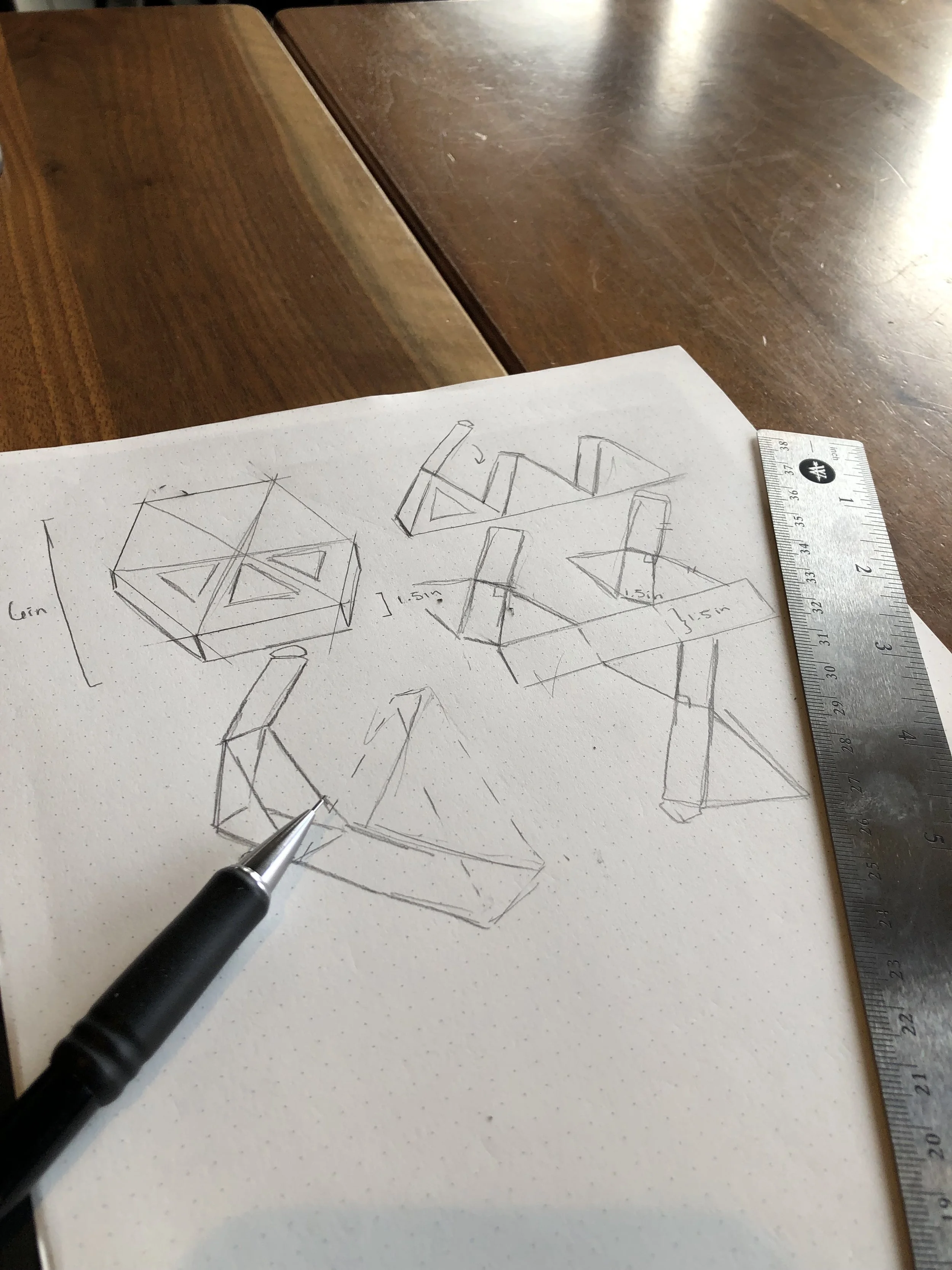
I began by sketching and prototyping the my own dieline.
Early iteration of the package design exploring locking tabs. These tabs were eventually phased out in favor of an overall cleaner package design and ease of opening.
Making the final package.
Final Product
I chose bold, rich accent colors and craft paper for the final design to make the Lunchables more upscale and hand crafted.


