
Ryde
An accessible solution for car infotainment systems.

overview
Ryde is a car infotainment interface that reflects the needs of an aging demographic through utilizing VUI and streamlining the user experience. Larger interface components, familiar UX patterns, and UI elements designed for speedy decision making reduce the cognitive overhead needed to complete tasks while driving.
Project Timeline
15 weeks
Role
Owner of project—concept to creation.
Deliverables
Branding • Digital Product • 3 Use-Case Flows
Keywords
User Experience Design • Brand Identity + Expression • Motion Graphics • Interaction Design
01 Observation
—
The Problem
As technology grows more complex so do our devices, including the ones in our cars. These interfaces, also referred to as “infotainment” systems, offer an impressive set of features and capabilities often including the ability to text, make phone calls, navigate and stream music all from the convenience of your car’s device screen. However, alongside these advancements come a set of barriers to access and safety risks.
Drivers ages 55+ take up to 10 seconds longer to complete tasks on their car interfaces while driving as compared to younger cohorts (according to a study by AAA Foundation).

narrowing down the problem
While all infotainment related tasks take drivers of all ages too long to complete, navigation proved to be the most time intensive, especially for older drivers.

02 Diagnosis
—
Breaking down the demographic
While all drivers take too long to complete tasks on their car infotainment systems, users 55+ take significantly longer than their younger cohorts.
Online Survey
After identifying the target demographic, I conducted a survey of 23 adults to get a better sense of what is lacking in current interfaces and what the barriers to use are for this specific demographic.

Affinitization
After conducting user interviews and doing research, I created an affinity map to organize keyfindings from the demographic.
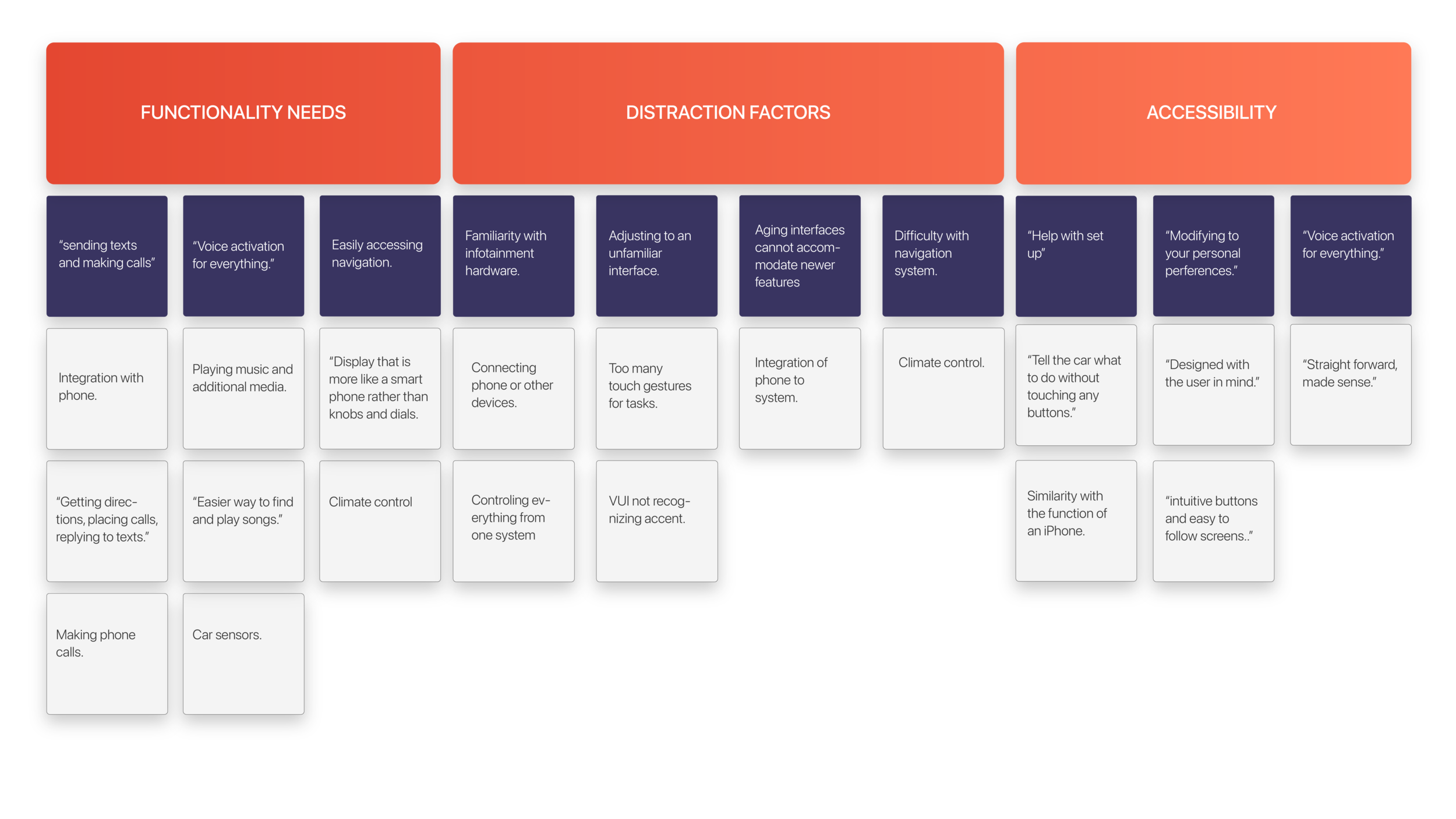
Based on the range of responses, I gathered key insights:

Competitive research
From the beginning of this project I researched multiple different infotainment systems to assess their usability. Looking at some of the most popular infotainment systems out there, I assessed the strengths and frustrations posed by each.


Assessing the insights gathered through research, I formulated questions to help guide the solution.

03 Informed Solution
—
A simplified car infotainment system to streamline the driving experience and reduce the time needed to complete tasks while driving. Ryde uses visual, interface elements, as well as intuitive user experience to help drivers easily identify where and what to touch to complete actions.
Information architecture
Through my research I had found that a main complaint and component of drivers’ frustration with existing infotainment systems was tasks and various items being unnecessarily buried deep within the architecture of the product. When developing the experience, I aimed for a system that allowed users to access each action within one to two taps in order to reduce the amount of time spent looking away from the road.

wireframes
To block out some of the user experience, I created wireframes and tested the touch area and accessibility of each menu item with the target demographic.

Iteration
From the preliminary wireframes, I moved to developing the visual language and testing the mid-fidelity wireframes.


User Testing
Testing the iterations above, I gathered key insights to help guide the high-fidelity prototype.

Final Designs
—
Addressing the issues identified in earlier iterations of the interface, the final product incorporated a re-thinking of the use of color throughout the system to help users quickly identify various components of the interface.
Because user research revealed that phone functionality and navigation were the top essential tasks while driving among users, I decided to focus on these two use-cases.

streamlining Navigation
—
Navigational screens within infotainment systems were a universal “sticky” point for users. An important improvement to this experience was to bring the most useful navigation locations up front, so they are easily accessed in only one tap.
To establish simplicity and clarity, the amount of information displayed was reduced, allowing the user to maintain agency but reducing the time needed for decision making.
Drivers responded best to interfaces which they were familiar with. Incorporating multitasking features that behave similarly helps drivers by reducing the amount of new interactions they need to learn.
VUI Components
The VUI drawer within the interface uses color and visual feedback to reinforce the actions of the driver. In order to limit distraction, When drivers are commanding the interface through the VUI system, they cannot complete other actions via touch.

Key Takeaways
—
As a designer, I learned to design for a demographic outside of my wheelhouse. In choosing a demographic I was removed from, I had to rely entirely on my user research and process to guide my decision-making instead of relying or falling back on personal instinct or design sense. Though I was uncomfortable at first and stuck, I was able to work through that through iteration and testing.
Additionally, I learned to incorporate motion in a way that helped aid the user along their journey and interaction with the product without being overly complicated with the effect of creating distraction.
